BuzzFeed Overview
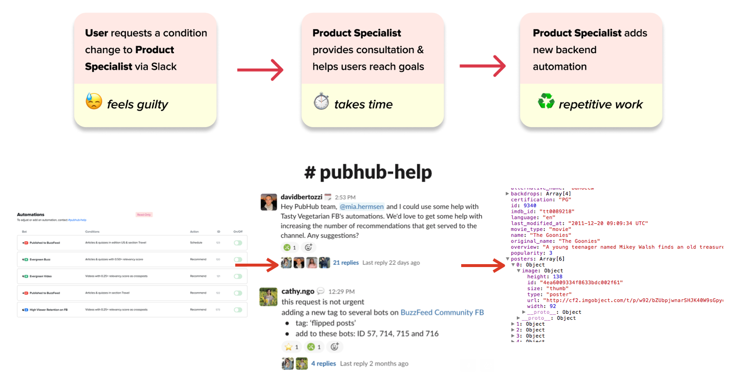
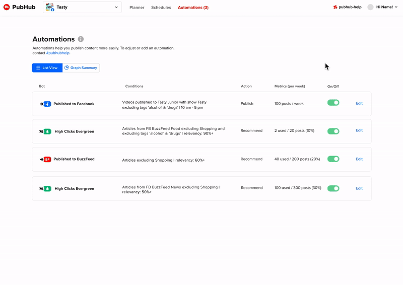
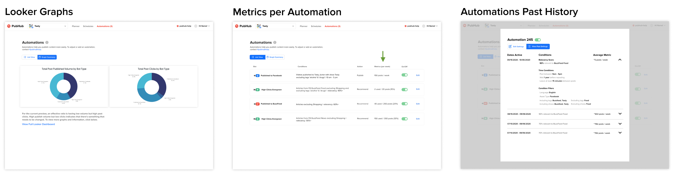
Currently, a majority of content on BuzzFeed socials is auto-generated. A bulk of social media posted content is actually older BuzzFeed articles that have done well in the past. Articles are auto-posted or recommended to social media strategists to be posted through a platform called Pubhub automations. Although this saves a lot of time, it takes a decent effort to optimize automations because users (social media strategists), don't have any editing privileges.
Problem
Currently to edit an automation users have to talk to the product specialist. This causes several problems:
-
Lost time ⏰ spent on consultation and manual changes on the backend could be used for other purposes
-
Disincentivizes users ❌ to experiment with their social automation strategy as they feel like they're bothering the product specialist with the slightest changes
-
Decreases autonomy 🤔 for users to learn how they can optimize automation parameters for themselves
Solution Overview
An interface that allows users to directly experiment and adjust their current social media automations.
As a stretch goal I also ideated some ways metrics could be incorporated to evaluate the effectiveness of different automation settings.
The Process: User Research
To inform design decisions for the final product, I had to understand the fine details of what users were currently doing. During user research calls with ten social publishers of varying rank - I asked:
- How do users make these decisions to edit parameters? Are there ways we could provide information to help them?
- Got a list of parameters and how often they're typically used to help introduce an engineering scalability plan as well as important metrics that help guide decision-making
- What is the current state of education with automations within the social publishers?
- Users are not intimidated by automation technicalities but rather they're unsure how different parameters affected results
- What action flows (editing, creating new automations) do users do the most?
- Users edit more than create, they will focus on only editing one automation at a time
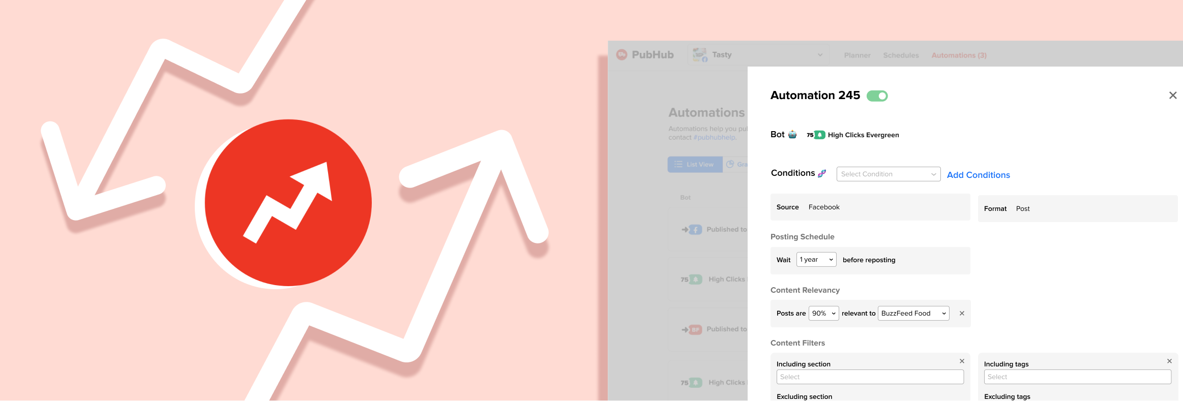
Part 1: Prototyping Editing Interface 📝
While prototyping there was no pre-defined design system, however I looked through previous design files and made sure to keep consistency in type, buttons, toggles, symbols, form components and tabs by utilizing components and style Figma tools.
Details View Overview
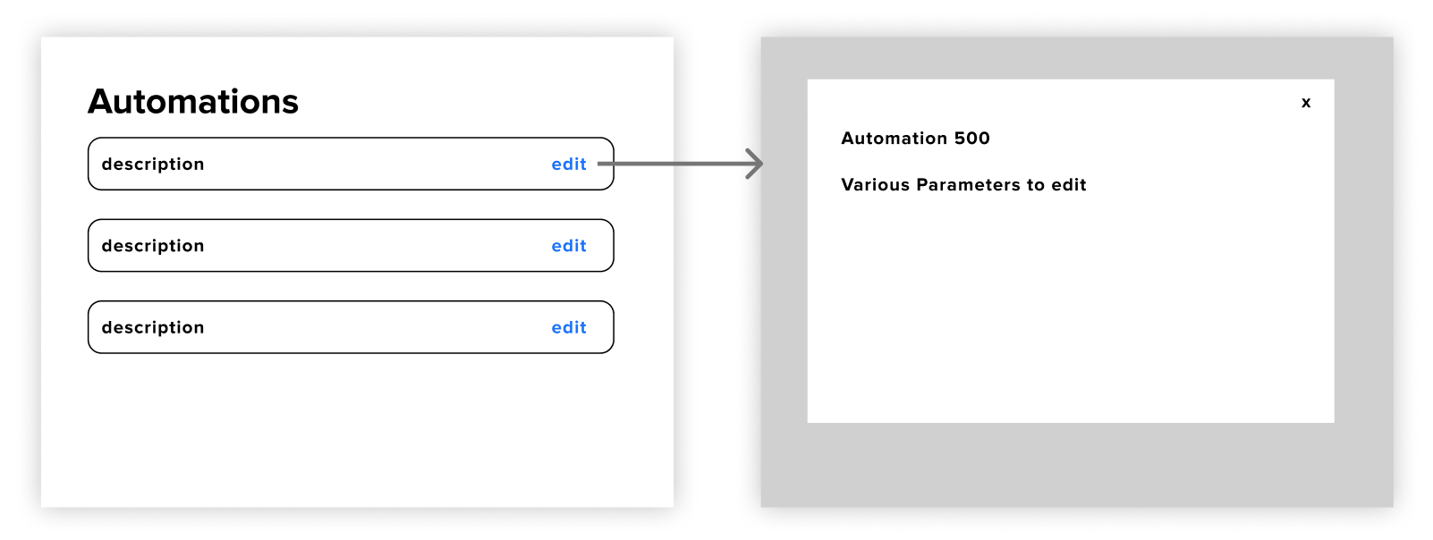
For the general flow I had settled on having the details view show up through a popup do reduce cognitive friction of opening a new page and allow users to do their day to day of quickly checking on different automations.
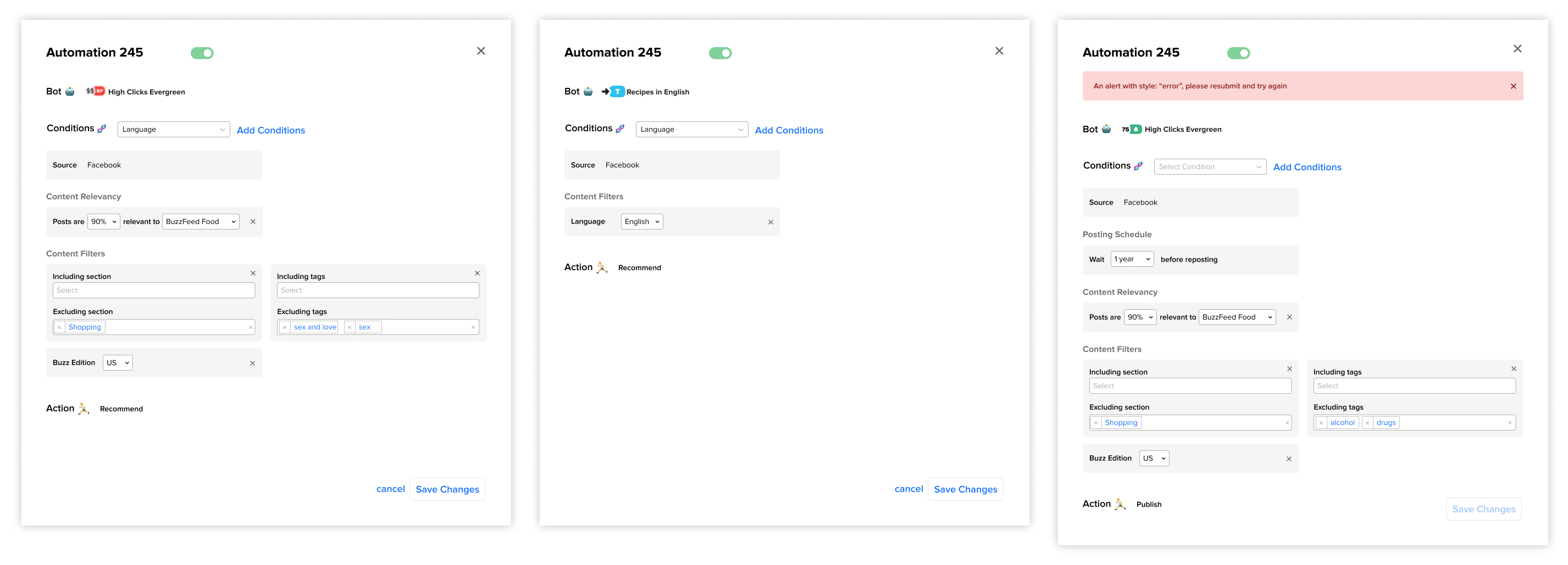
How do we add and remove conditions?
Adding
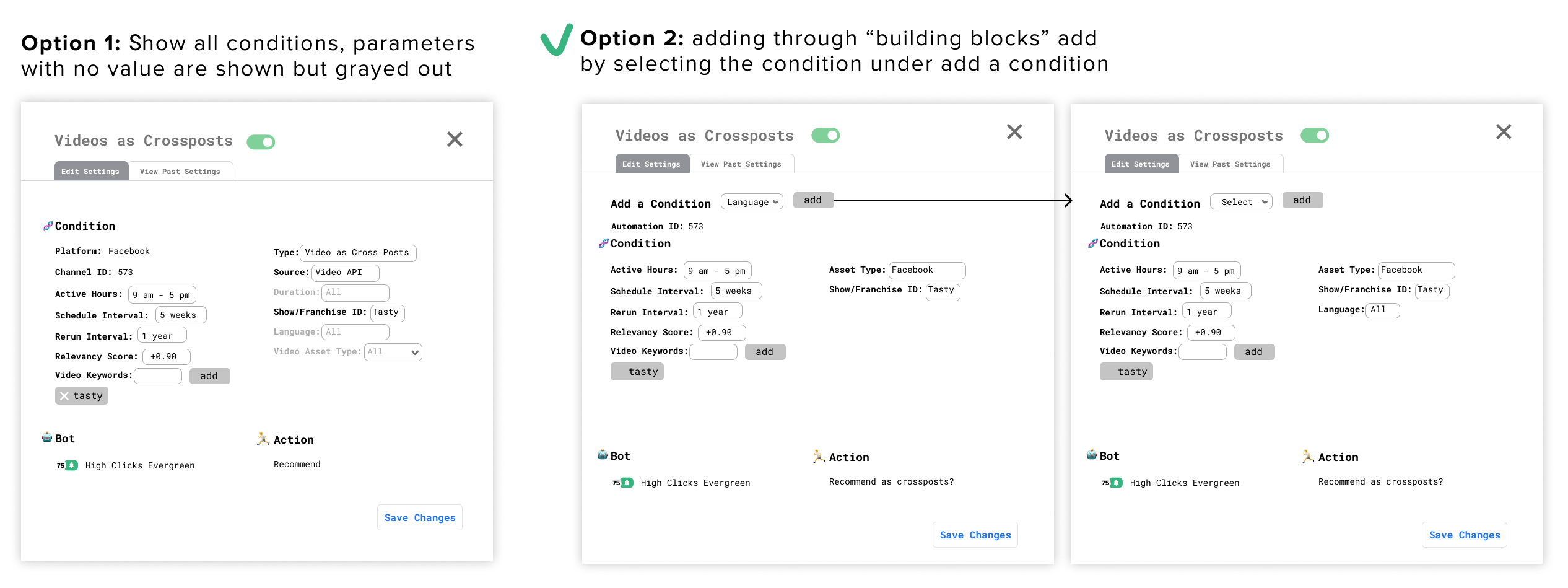
I went with option 2 because we didn't want information overload on the users by showing all the possible conditions they could activate when they only focused on one or two at a time. Because users tend to edit more than add new conditions it was better to have them focus on the edit action.
Editing/adding in a Block Format
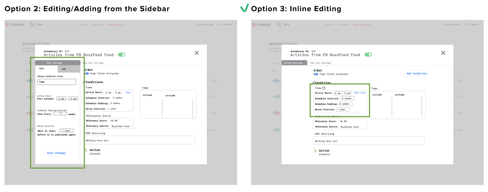
In the end I went with inline editing and adding because there wasn't any supplemental detail for each condition to justify a focused-in sidebar view.
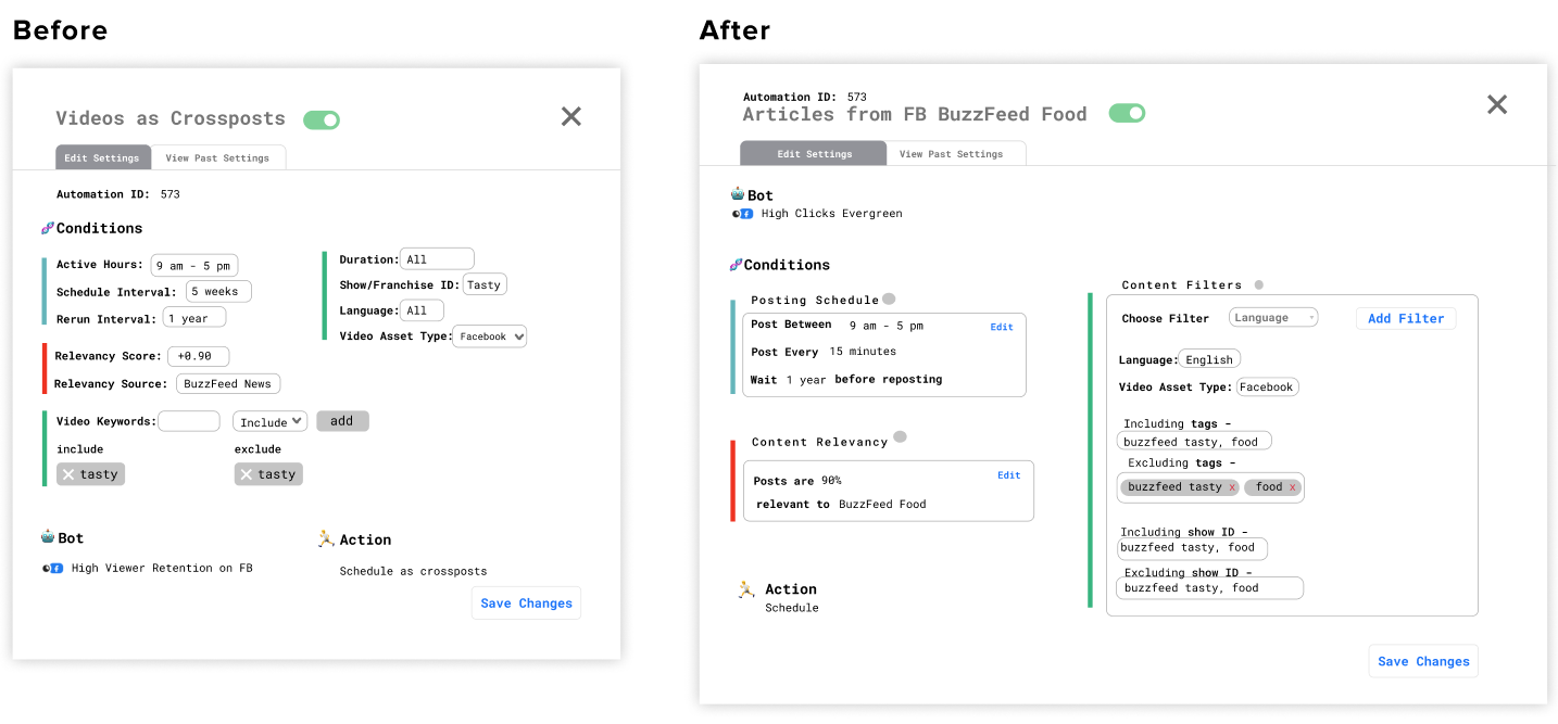
Content Design: Making a Human Readable Format
There were two key edits involved to mitigate the need for explanatory supplemental text. One was breaking it up into three subsections that also had titled explaining the functions of each. The other was changing technical terms like "active hours" to more understandable ones like "post between".
User Testing + Feedback
After 5 rounds of user testing, I found most tasks were completed. The only struggle was that users would find the "Add" button but not understand what it meant. Once users interacted with the dropdown they were able to accomplish the task successfully. As a result, I changed the language of the add entrypoint from "Add" to "Add Condition". Although a small fix, I felt like it was the one that maximized feasibility and effectiveness.
Not only was the prototype, but it also had strong product value. Below is a quote from the head of social strategy, a stakeholder that manages all the social media strategists (user of the tool) and sets the tone for the team.
Solution Overview
I ended up with positive feedback not only from the social media publishers on Buzzfeed, but also the Director of Social Media Strategy herself approved of the designs and agreed with the value-add of the product. I also designed future state ideas beyond the MVP that focused on understanding the success of different automations that also received positive feedback from product.
Edge Cases
I also collaborated with product and engineering to understand edge cases and prepare files for handoff.
Measuring Success
I would measure the success of this feature by qualitatively noting any changes in strategists' plans and observing the frequency and average time spent per day on the editing pages as well as the metric pages.
Takeaways
Validate with limited testing - I learned how to formulate hypothesis and different decision frameworks to predict which designs would work best for users.
Exercise product-thinking early - My first project was a notifications project, however I was able to quickly scope out the project and determine for the engineering capacity given, it would be better to use a free out-of-box alternative.
Extra
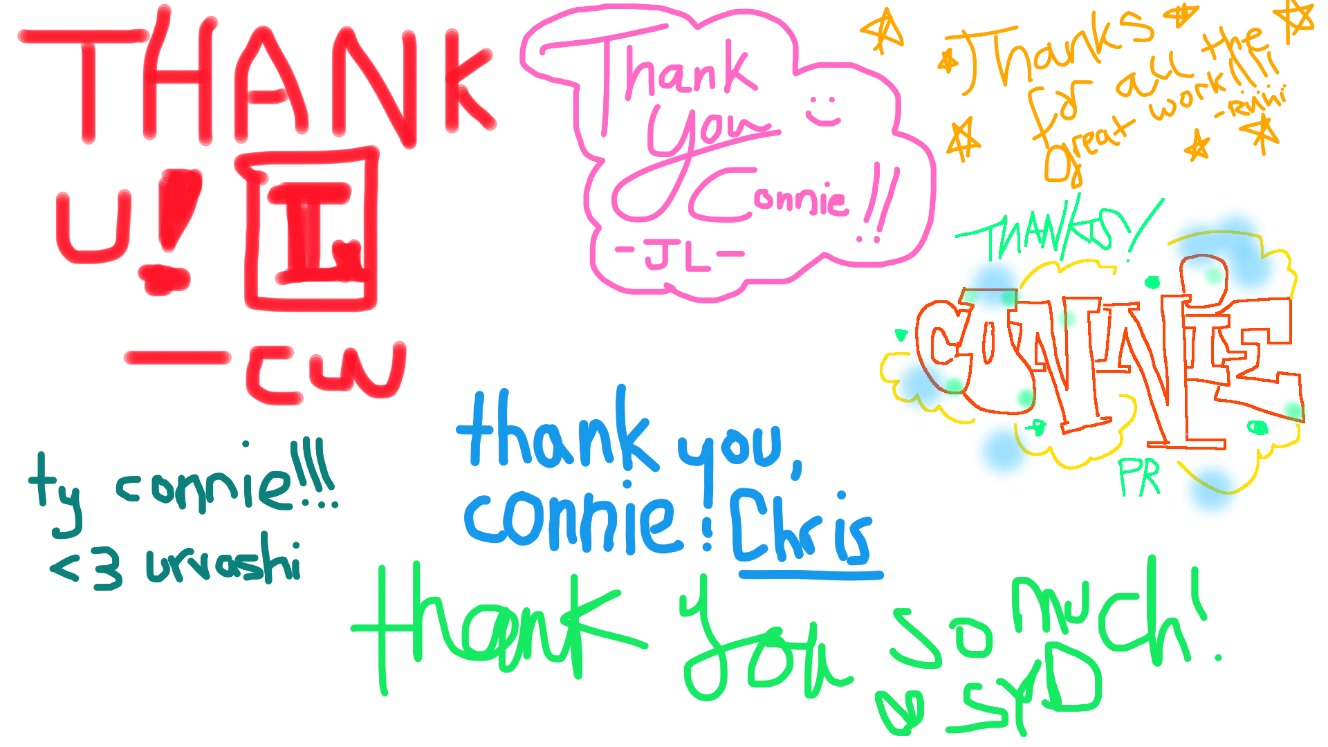
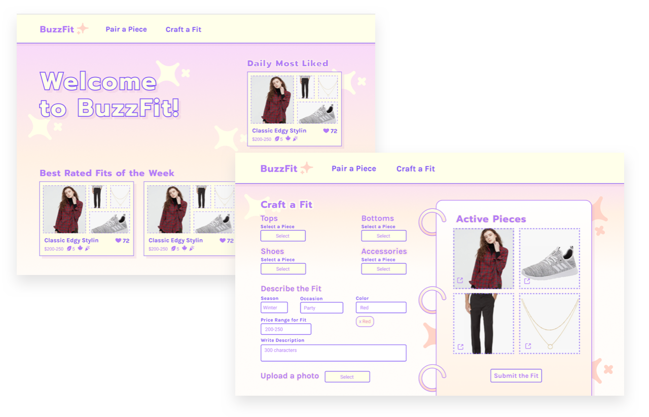 I also participated in the company's week long hackathon to craft a 0 to 1 project incorporating our new e-commerce partnerships!
NYTimes: Constraints and Learnings
Due to its proximity to traditional news management, the team I was on at NYT was extremely limited in giving designers agency. Here is how I navigated around constraints:
-
A low-bandwidth PM who was managing four teams - I navigated around this by asking other team members on analogous CMS products about their design process to reduce the number of iterations. Also I juggled two projects so I could work on one while waiting for the PM to answer my questions async.
-
Restricted user interaction - Because our users were busy journalists, it was difficult to get feedback even for an internal tool. I relied on documentation from prior research sprints to get up to date with user problems and prepared for weekly 10 minute calls with product onboarding liasons who served as a proxy.
-
Lack of documentation - To better understand the design workflow, I asked designers what got most stakeholder buyin. Due to the team's low engineering bandwidth I learned feasibility was emphasized, I used this as a north star in proposing my ideas which were eventually sent to production.
Work Overview
At this time my work is under NDA as it falls under internal tools. Over my time at NYT:
-
Shipped "Hold for Order" (work for a specific event that will happen in the future) label integration to the Live Admin CMS (Content Management System).
-
Shipped four workflow improvements to Pilot to ensure bursts (example below) are published in a readable manner utilizing NYT's Ink design system.
-
Prototyped MVP of live video minimization micro-interaction with feasibility input from lead engineer and manager of 16 person working group.
-
Proposed PM - designer organizational communication improvements to give designers more product agency
-
Worked on 4 maker week projects (week long hackathon), won best UI for octopus illustrations for Kids App.
In summary, I learned a lot about how to navigate a resource-constrained environment and for advocating my value as a designer. I look forward to my next adventures in design!